Remember how basic the Facebook status update used to be?

Now, that same space contains an array of sophisticated text styling options that let users fully express what’s on their minds. This evolution has been driven by rich-text editors like Quill, which allow visitors to fully customize their content: from embedding photos and videos to adding emoticons. In this article, I’ll share a step by step guide to installing and customizing this open-source JavaScript tool.
I recently found myself in need of a simple, yet extendable, WYSIWYG HTML editor. A fully functional text editor is a complex piece of software, and writing one from scratch would not have been the best use of my time. I’m a big believer in not reinventing the wheel and making use of other people’s open-source code. But this mindset requires its own skillset: knowing how to quickly and efficiently evaluate options.
WYSIWYG Editor options
The first thing I did was to Google ’WYSIWYG Editor’. As expected, the results were overwhelming. I found dozens of different options, in various states of maintenance and quality:
Alloy Editor, Aloha Editor, CKEditor, Content Tools, Etherpad, Froala, grande.js, jodit, Medium Editor, Medium.js, Mobiledoc Kit, Pell, Pen Editor, ProseMirror, Quill.js, Squire, Scribe, Slate JS, Substance, TinyMCE, Trix, Trumbowyg, and wysihtml.
Wow. Where to start?
As a front-end developer, you’re likely familiar with this situation. Every tech stack decision requires sorting through an ever-increasing number of frameworks, preprocessors, JavaScript versions, and so on. Let’s take a slight detour from Quill.js to chat about evaluating software. Over time, I’ve developed a system of sorts for quickly doing this, which may be useful to you.
Spoiler Alert: I choose Quill.js at the end!
WYSIWYG Editor Evaluation Process
- Available options: Start by pulling together as many options as you can. While no search is complete without checking Google, I tend to refine my options on GitHub.
- Popularity: A popular project on GitHub means exactly what you expect it to. Namely, that there are lots of people questioning, contributing and supporting it. This activity tends to result in more reliable software. You can check the popularity of any project by looking at how many stars it has, how many issues are opened, how many pull requests are pending, and how many contributors worked on the project. The WYSIWYG editor with the most amount of stars on GitHub when I checked was Quill.js.
- Maintenance: Software becomes dated and buggy when not maintained. A nice proxy for this is to check when the last commits were made. If this was 4 years ago, I would go with another option. When carrying out my own evaluation, Quill.js was being updated weekly – a very good sign.
- Users: Some projects are backed by big players who will have a vested interest in ensuring the project is maintained. Quill.js has been used by many established brands including Linkedin, Salesforce, Asana, Front, Slack, Gusto and Buffer.
- Tests: I love tests. A really well-tested project counts for a lot in my eyes. It not only implies that the software does what it’s supposed to do, but also that the developer themself has a rigorous methodology. The metric used to measure how much code is executed when tests are run is called test coverage. The bigger the coverage the better, but be careful, 100% coverage doesn’t mean the product has no bugs. Unfortunately, in the case of Quill.js, I couldn’t see any coverage reports on GitHub. Instead, I checked if the build was being successfully compiled without problems – which it was.
- Downloads: Many package managers share their download statistics. For example, if you want to check the statistics related to an npm package, you can go to https://www.npmjs.com/package/name-of-package to see the stats. The stats for Quill.js show it’s downloaded around 400,000 times per week. For comparison, Slate, another popular WYSIWYG editor, receives around 140,000 downloads per week. Notice how I’m comparing Quill’s popularity to another editor here? It makes sense to compare vertically – not horizontally across the wider software ecosystem – because great software can be built to solve highly niche issues. You can also use nmp trends to directly compare packages like I’ve done for Quill against some of its top competition, pictured below:
Getting Quill.js up and running
Now we have settled on Quill.js as our WYSIWYG editor of choice, let’s look at integrating it into our site, which is a pretty straightforward task, as it turns out.
Start by including Quill.js and Quill.js.snow.css to an HTML file:
Note: I’m using Quill’s most recent version (at the time of writing) via CDN for simplicity’s sake, but you can of course use npm or yarn instead. If you do use the CDN, check the releases page to see if there’s a newer version available and update the version numbers in the above code. They also seem to be (slowly) working on a 2.0 release, so keep an eye out for that in the future – it may add new functionality and require steps to upgrade existing code.
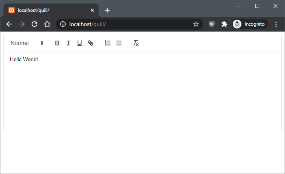
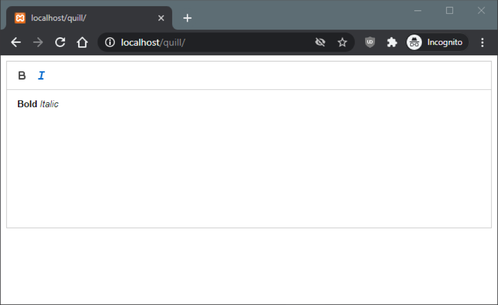
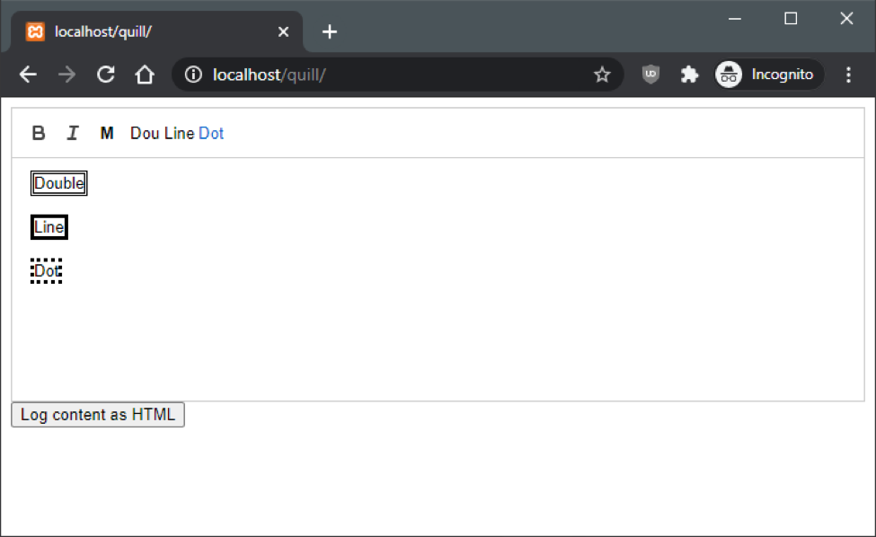
Now let’s add a Now let’s add a script section to the bottom of the HTML file and initialize Quill. To do this, we have to tell Quill the id of the div where we want the editor to be added. OK, we’re good to go! Open the file in your browser and you should see the default Quill.js editor view. Let’s customize the toolbar and specify the styles we want it to display. To do this, we provide an array of our desired styles to Quill’s constructor. As shown here: We only want to only support ‘bold’ and ‘italic’ styling, so those are the options we provide to the constructor. If you want to see all the possible styles supported by quill’s toolbar you can go to the toolbar section in Quill’s documentation. Your toolbar should now look like this: If your editor will be used within a commenting engine, you’ll need a way to access the generated HTML. So let’s see how we can log the contents to the console. First, let’s add a button inside our tag. This button is going to call a function and log the content of the editor. Next, we will create a toolbar with the following options: font size, font color and background color. We will also add the logHtmlContent() function. This will be called when a user clicks the ‘Log content as HTML’ button we added below the WYSIWYG HTML editor. Now reload the page and replace with some styled text: Now click the Log button and observe the output in your browser’s developer console: class="ql-size-large" style="background-color: rgb(0, 0, 0); color: rgb(255, 255, 255);">This is a text message. For some formats, Quill.js uses inline style on the HTML nodes. For others, it uses custom CSS classes. This is important because if you are saving these in a database, your CSS will have to support Quill’s CSS formats like ql-size-huge and ql-size-large. Quill developed their own format, called Delta, to describe content and changes. It’s a human and machine-readable description of your text editor, but without the complexity of HTML. While covering it is beyond the scope of this post, you can dig deeper yourself by checking out their documentation. Once you start familiarizing yourself with Quill.js, you may want to use formats that are not provided by default. For example, let’s say you want to add support for highlighted text using HTML’s tag. Quill’s document model is called Parchment. Think of it as a custom DOM: little building blocks that, when put together in a certain order, build a document. So depending on the custom format we want to add, we will need to extend one of these ‘blocks’. In the parchment world, these building blocks are called “Blots”. We’ll start by adding a ‘M’ button to the toolbar, that when clicked, surrounds the selected text with tags. The above snippet is pretty easy to understand. We start by extending a class, setting a name for the blot and its associated HTML tag, then registering that blot so it can be added to the editor. You can add it at the top of your script tag before Quill is initialized. We now need to create a button to toggle the custom format. This time, to add the button to the toolbar, we will create our toolbar in plain HTML. We’ll use this method instead of the previous method where we sent Quill an array of formats. To accomplish this, let’s create a new Inside this Once done, we need to initialize Quill. This time we need to provide Quill with the id of the toolbar we just created. This is the id of the div that contains the toolbar buttons: Refresh your browser and you should see your new functional Mark button. Try it out! Let’s raise the bar a bit here and create a truly custom style. “How about a text selection with a dotted border?” Good, I was hoping you would say that. To do this we are going to use Attributors. In Parchment, an attributor is a lightweight way of representing formats. There are different types of attributors: here we are going to choose one that lets us apply a class to a selected element. The above constructor receives three parameters: attributor name, key name, and a configuration object. We are creating a class attributor, which means that a class will be added to a node. In our example, the classes will be: “line-solid”, “line-double” and “line-dotted”. Now we need to add the buttons that are going to apply the classes to our previously defined toolbar: Each new button has two attributes. The class tells Quill.js which attributor is going to be applied when clicked. The value defines which class the button is going to apply. These value options have to be previously defined when creating the attributor in the configuration object. Before we test this, let’s define the new CSS classes that will apply the format to our selections: OK, let’s refresh the page and see our new styles in action: Those of you paying attention may be wondering “Why didn’t he just create a new blot called BoxBlot?” Great question. A blot creates a node, and we don’t want to create a node as they are used to group information and give semantic meaning. Here, we simply want to apply a format which is best done with an attribute. While all three of our new buttons work, only one can be applied at any one time, so they should really be grouped together. Besides being just better UX practice, it will also serve to declutter the toolbar. Next, we have to add the following CSS rules (I came up with these rules after inspecting how Quill.js was building its fonts dropdown): We’re done! The end result should look like this: We started off the article with a rundown of the process I use to evaluate software with a focus on picking a WYSIWYG editor. As talented developers keep adding to the myriad of software options in the market, it becomes more and more important to be able to quickly and efficiently filter through them. The wrong choice can leave you in development hell: having to deal with buggy or unsupported products. It’s that evaluation process which initially led me to the excellent Quill.js. The bulk of this article demonstrated not just how easy it is to set up, but how extensible and adaptable it is. If you want to provide your visitors with the rich text styling options they are becoming used to, I encourage you to try and work through the examples above. To do so, just head over to CodePen where I’ve stored all the code and functional examples of this project. Good luck! Are you searching for your next programming challenge? Editor’s note: This article was originally published on December 27, 2017, and was updated on July 31, 2020.
Extending Quill.js to support custom formats
let Inline = Quill.import('blots/inline');
class MarkBlot extends Inline { };
MarkBlot.blotName = 'mark';
MarkBlot.tagName = 'mark';
Quill.register(MarkBlot);
var quill = new Quill('#editor', {
  modules: {
    toolbar: {
      container: '#toolbar'
    }
  },
  theme: 'snow'
});const Parchment = Quill.import('parchment');
var boxAttributor = new Parchment.Attributor.Class('box', 'line', {
scope: Parchment.Scope.INLINE,
whitelist: ['solid', 'double', 'dotted']
});
Quill.register(boxAttributor);
.ql-snow .ql-picker.ql-box .ql-picker-label::before,
.ql-snow .ql-picker.ql-box .ql-picker-item::before {
    content: 'None'
}

.ql-snow .ql-picker.ql-box .ql-picker-label[data-value="solid"]::before,
.ql-snow .ql-picker.ql-box .ql-picker-item[data-value="solid"]::before {
    content: "Solid";
}

.ql-snow .ql-picker.ql-box .ql-picker-label[data-value="double"]::before,
.ql-snow .ql-picker.ql-box .ql-picker-item[data-value="double"]::before {
    content: "Double";
}

.ql-snow .ql-picker.ql-box .ql-picker-label[data-value="dotted"]::before,
.ql-snow .ql-picker.ql-box .ql-picker-item[data-value="dotted"]::before {
    content: "Dotted";
}

.ql-snow span.ql-picker.ql-box {
    width: 8em;
}Summary
Scalable Path is always on the lookout for top-notch talent. Apply today and start working with great clients from around the world!


